Did you know that the colours you choose for your home can affect your mood and productivity? The many insights of neuroarchitecture - a fascinating field combining architecture, neuroscience and psychology - can help provide you with the tools to design spaces that truly enhance your wellbeing.
If you're wondering how to transform any corner of your home using the power of colour, we have tips and examples to help, guided by the expertise of two experienced professionals: Maria Gil and Pia Lopez-Izquierdo, who are both architects and interior designers.
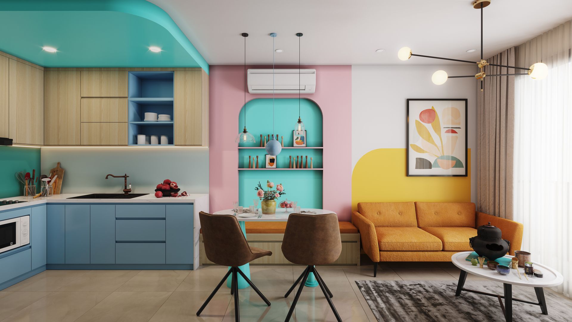
1/10
Green is a colour known to help reduce stress
How colour psychology affects mood and behaviour at home
To start, Maria highlights that, according to studies, about 80% of the information we gather from our environment is visual. And of that visual information, colour - which is processed by the brain even before we recognise shapes - accounts for roughly 40%.
These facts underscore the vital role that colour plays in any environment. "Colour does more than just alter the perceived size or aesthetics of a room," she explains. "It also profoundly affects mood, productivity and even interpersonal dynamics."
To demonstrate, the interior designer highlights a few common colours and their impacts:
- Green has a restorative effect, helping to alleviate stress and anxiety.
- Blue is known to aid concentration and focus, making it an ideal choice for home offices and study areas.
- Red stimulates mental activity and encourages conversation, though it should be used sparingly as it can easily become overstimulating.
You may also like
2/10
The impact of your home's palette also depends on factors ranging from cultural context to personal history
The science of neuroarchitecture: Why personal colour choice matters
Neuroscience reminds us that while certain colours might evoke universal emotions, their effects can also be impacted by individual factors such as age or personal history.
Cultural context also plays a vital role; for instance, the colour white - like Pantone's 2026 Colour of the Year, Cloud Dancer - symbolises purity in European and North American cultures, it is traditionally associated with mourning in parts of East and South Asia.
Maria explains that, despite these nuances, some colours possess a near-universal appeal - specifically those rooted in the natural world, such as forest greens or the blues that we find in the sky and sea.
These shades tap into our evolutionary heritage, fostering a sense of serenity by echoing the environments that were once essential to our survival.
She adds: "If we incorporate the colours linked to the places where we have felt happiest, we can evoke emotions in our home that make it feel as though we're on holiday all year round.
"As a personal example, I painted my living room and bedroom the exact shade of the sand at Rota beach in Cádiz, Spain, where my family holidays. [It] brings me the peace and stress-free sensation of being by the coast."
3/10
A minimalist interior by Pía López-Izquierdo showcases a high-gloss pink kitchen as well as contrasting cyan blue and classic furniture
Choosing between monochrome and contrast in interior design
In 1945, the architect Le Corbusier remarked that the bourgeoisie were afraid of colour because, essentially, it was looked poorly upon to stand out.
Pia believes this observation remains remarkably relevant today. "It explains why trends and decorative styles often shy away from bold chromatic choices, and many opt instead for neutrals, greys, whites and beige tones.
"However, factors such as culture and climate are equally decisive; cultural traditions rich in vibrant hues or even the local weather can profoundly shape our relationship with colour."
We all have a colour that resonates deeply with our identity, even if we hesitate to use it in our homes. These colours have the power to reconnect us with our authentic selves as well as our physical and emotional and origins. "Yet, despite our deepest inclinations, trends almost always seem to prevail," Pia laments.
So, should you choose monochrome or a more dramatic look? Either approach can work, provided you respect what the Swiss architect Peter Zumthor described as "Atmospheres" - a term he coined to define the sensory beauty of interior architecture.
In the context of colour, it involves achieving a balance in the 'temperature' of each space - whether its in monochome or high contrast - while considering the depth, coolness and tonal weight of your chosen palette.
4/10
Vibrant living room designed by Pía López-Izquierdo Botín featuring a bold red accent wall and a large seafoam green sofa
How to use high contrast to create dynamic living spaces
If you love strong colour contrasts, keep in mind that they operate on two distinct levels:
Visually, contrast aids perception. It is a well-established principle that high contrasts enhance visual sharpness. White appears more brilliant when placed next to black, and vice versa. Similarly, using complementary contrasting colours allows opposing hues to make one another 'pop'.
Spatially, contrast highlights forms by emphasising volume. It can be used to dilute or camouflage the size of a space, and to add or remove a sense of depth.
When used to divide up a space, contrast can also help give prominence to zones that might otherwise feel nondescript, by ensuring that each area is intentionally crafted and designed.
5/10
Colours inspired by the natural world can help us relax and reduce cortisol
The best calming colours for stress relief and restful bedrooms
Colour reveals its true complexity when it completely envelops us. "Slightly off-white and pale pearl grey hues are choices that evoke a sense of 'fullness', Pia explains. "This is why many architects frequently default to these shades."
However, reduced cortisol and lower stress levels are more closely linked to a colour's ability to soothe us - a result often achieved not through neutrals, but via palettes inspired by the natural world, such as earth and sandy tones, botanical greens and aquatic blues.
Maria adds that cool tones associated with nature are renowned for their restorative properties, but they have to be applied wisely to be effective.
She offers these key examples:
Sky and sea blues: These shades evoke natural serenity and are perfect for promoting a sense of calm. Lighter hues are particularly recommended for bedrooms. Beyond their relaxing qualities, they visually expand a room, creating a sense of openness. Their impact on the nervous system is so profound that blue paint has historically been used on bridges to help deter people from jumping.
Botanical greens: Evoking the freshness of the outdoors, green is an excellent choice for creating a tranquil atmosphere in living rooms. It is ideal for spaces requiring focus, such as home offices or reading nooks, providing balance while making a room feel larger due to their 'receding' or blurring effect on boundaries.
Pink: Although less common in traditional interiors, pink has a powerful sedative effect. Because of its calming influence, Baker-Miller Pink cells have famously been used in some prisons and police stations across the US and Europe. Studies have shown that after someone spends just ten to 20 minutes in an immersive pink room, levels of hostility and aggression drop significantly.
6/10
The key is to personalise your home with colours that not only support focus but also foster a genuine emotional connection
Vibrant accent colours to boost creativity and focus
Neuroscience suggests that a colourful environment can stimulate cognitive processes, boosting performance, creativity and overall wellbeing.
Maria explains that saturated, vibrant shades, such as yellow and orange, are excellent for energising a room.
These optimistic hues can be highly effective in creative studios or children's study areas. However, the expert warns: "They should be used sparingly, for example as accent notes on walls, furniture or accessories.
"If used in excess, these tones can become visually exhausting and lead to sensory fatigue."
To avoid overstimulation, it is best to layer vibrant accents over a neutral or calming base of white, blue or green. This balance creates an environment conducive to both emotional and cognitive development.
7/10
Cool tones are an excellent choice for compact areas
Using colour to make small rooms look larger
The strategic use of colour can fundamentally alter our perception of a room's dimensions. Maria suggests techniques to "trick" the mind, making even the smallest spaces of your home feel significantly larger.
- Cool tones: To create a sense of spaciousness, opt for cool tones including green and blue. These hues are perceived as "receding", effectively making the walls appear further away. Consequently, they are an excellent choice for smaller rooms or areas where you wish to convey serenity and openness.
- Colour drenching: Another effective strategy is to paint your furniture in the same shade as the walls. This creates a monochromatic effect, allowing bulky items to blend into the background. The resulting continuity eliminates visual clutter, making the space feel more expansive.
It's important to note that warm hues found on the opposite side of the colour wheel, such as vibrant yellow, orange and red, are "advancing" colours. They tend to draw the walls inward, creating a more intimate, enclosed feel that can make a small room feel smaller.
8/10
A bold and bright feature wall or artwork can add a vibrant touch without dominating the room
Two common interior design colour mistakes to avoid
Be careful with colour - particularly bold, warm palettes and extremely dark, cool tones.
Maria explains that warm, saturated shades, such as red, orange and yellow, have a direct stimulating effect on the nervous system. While they inject energy and vitality into a space, overusing them can lead to increased stress, irritability and even a heightened appetite. (In fact, many fast-food chains strategically employ these hues to encourage quicker eating.)
In a domestic setting, particularly in kitchens or dining rooms, these colours can inadvertently disrupt family harmony and undermine dietary self-control.
"It's often wise to limit intense, warm colours to accent pieces or 'transitional' spaces, such as hallways, stairwells, or cloakrooms, where their stimulating effect won't feel overwhelming," she suggests.
Conversely, extremely dark, cool tones can have a suppressive effect on the nervous system if used too liberally.
In some contexts, this may evoke feelings of lethargy, isolation or a lack of energy. Consequently, very dark shades are often best reserved for accents and decorative elements, such as furniture, cushions or accessories, rather than being applied all over.
9/10
The lighting design in your home directly impacts your health
How lighting and chromotherapy affect your circadian rhythm
Maria says that one of the most significant studies she has encountered in her career is the work of German researcher Fritz-Albert Popp. In 1982, Popp's research suggested that our cells emit and receive light, leading to the fascinating concept that we are, in a biological sense, beings of light.
On a related note, chromotherapy (also known as colour therapy) uses the spectrum of colours to balance physical and emotional health, based on how different light frequencies interact with our bodies.
What does this mean for neuroarchitecture? You should pay meticulous attention to general lighting design in your home, as it directly impacts your health.
It is now well-established that light which disrupts our circadian rhythm - the body’s internal 24-hour clock - negatively affects sleep quality, mood and overall wellbeing.
"This is why it is essential to opt for warm, low-intensity lighting in the evening to mimic the natural glow of a sunset. This simple adjustment does more than just create a relaxing atmosphere; it helps synchronise our biological clock, promoting restful sleep and greater vitality," the architect advises.
10/10
PIA
Why neuroarchitecture is the future of accessible social design
Maria believes that neuroscience applied to architecture should be accessible to everyone. Colour is one of our greatest allies, as it is one of the most versatile and cost-effective parameters in design.
"Walls are more than just structural elements; they enter into a direct dialogue with our bodies and minds, profoundly affecting our emotional state. Selecting the right palette for these surfaces in particular can foster wellbeing, serenity or vitality."
The expert highlights an iconic case study demonstrating how colour can transform the social and emotional dynamics of an entire community.
In 2000, the Albanian capital Tirana was plagued by urban decay and high crime rates. The then-mayor, Edi Rama, launched a project to paint the city's Communist-era grey apartment blocks in vivid colours and bold patterns. This relatively simple intervention achieved extraordinary results: it led to a drop in crime, improved street cleanliness and restored public trust in civic institutions.
About the experts:
- María Gil Díaz is an architect, interior designer and founder of the Spanish Academy of Neurosciences for Architecture and Design (AENAD).
- Pía López-Izquierdo Botín, who holds a PhD in Architecture, is the lead researcher for the Active Colour Theory in Architecture (TECA) group at the Polytechnic University of Madrid, and is also a lecturer at AENAD.